Chosen theme: Minimalist Color Palettes. Discover how fewer hues create clarity, emotion, and unmistakable identity—without noise. Explore principles, stories, and practical steps, then join our community to share experiments, ask questions, and subscribe for fresh palette prompts.
What Makes a Minimalist Color Palette Work
The Strength of Restraint
Limiting your palette reduces cognitive load and sharpens focus. With fewer hues competing, typography, spacing, and imagery carry meaning more clearly. Try removing one color from your current design and observe what becomes more legible. Tell us what changed and why it surprised you.
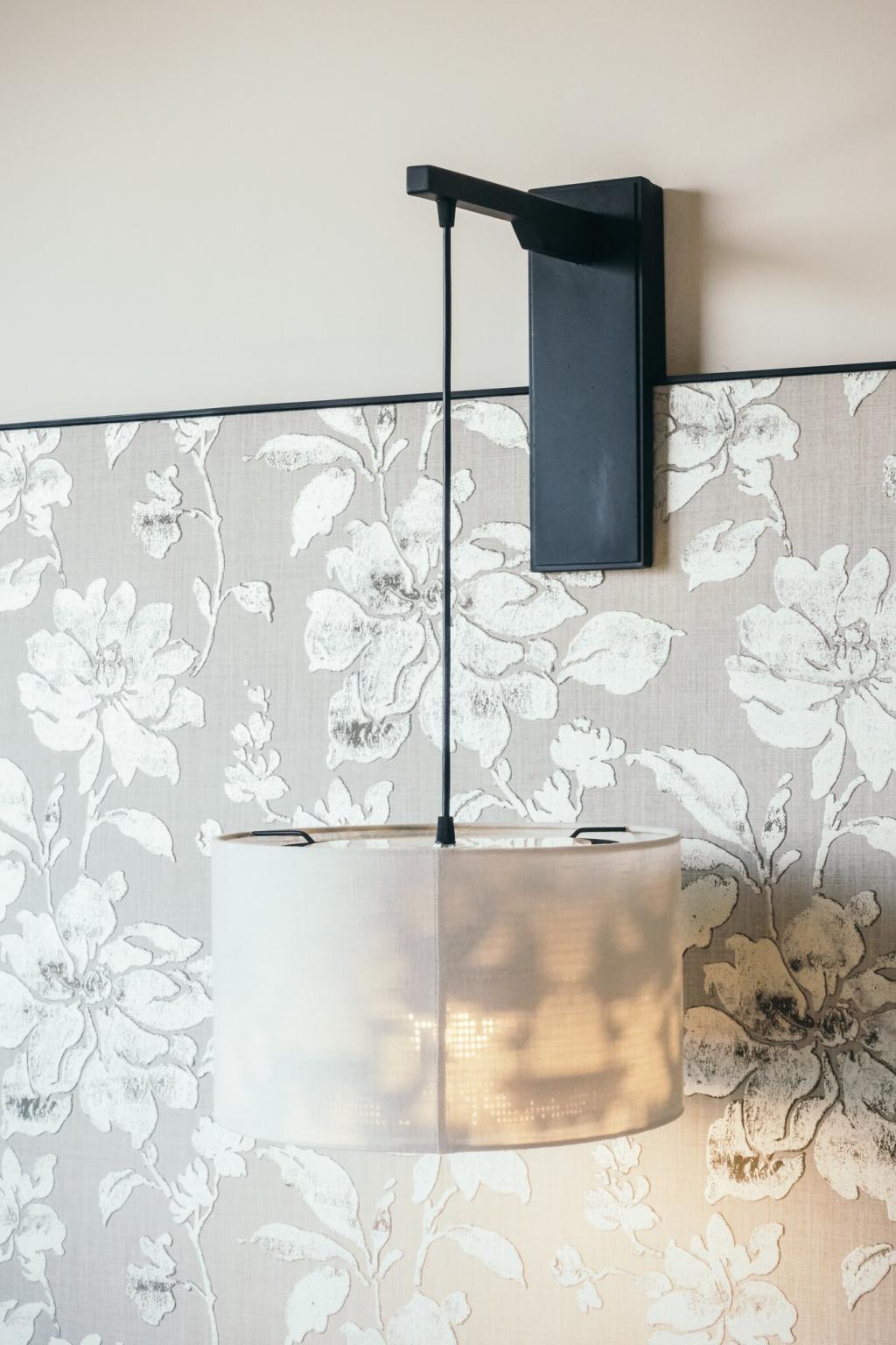
Neutrals That Breathe
Soft whites, warm grays, and muted taupes create visual breathing room. Off-white can feel art-gallery refined, while bone or ecru introduces warmth without clutter. Neutrals amplify texture and light, letting content lead. Comment your favorite neutral hex and where you’ve used it successfully.
Accents With Intention
A single accent color directs attention with surgical precision. Keep the base neutral (80%), supportive tint (15%), and accent (5%). This balance prevents visual shouting and preserves hierarchy. Try swapping your accent for one bolder step, then share before–after screenshots with our readers.
White signals clarity, cleanliness, and openness, especially when paired with generous spacing. It reduces visual friction and invites slower, more mindful reading. Use white to frame key actions, then observe reduced bounce rates. Share your metrics and the page section you optimized.
Desaturated blues and soft greens calm the nervous system and support sustained attention. They’re ideal for dashboards, reading apps, and wellness brands. Keep saturation low to avoid distraction. If you’ve replaced vibrant hues with muted tones, describe the impact on readability and user feedback.
Black, charcoal, and crisp white create striking clarity and decisive hierarchy. This palette pairs well with bold grids and strong type systems. Use contrast to emphasize actions and essential data. Post your favorite monochrome pairing and how it changed your interface or brand tone.
Define what you want users to feel and do, then set constraints: three to five colors, two contrast levels, and one accent rule. Align choices with audience expectations and environment. Share your palette rules in the comments to inspire others and get constructive feedback.
How to Build Your Minimalist Palette
Choose a neutral base for backgrounds, a darker shade for text and dividers, and one accent for calls to action. Add one supportive tint for hover or subtle emphasis. Keep naming consistent. Post your token names and hex codes so readers can remix your system thoughtfully.
Brand Stories: Minimal Colors, Maximum Memory
A Neighborhood Coffee Roaster’s Two-Tone Rebrand
We simplified a cluttered palette into charcoal and cream, with a single amber accent for product labels. Sales materials instantly felt premium, and wayfinding improved in-store. Customers described the brand as calmer and more confident. Tell us if two tones could sharpen your identity today.
Consistency Beats Variety
Recognition grows when colors appear predictably across touchpoints—packaging, site, social, and signage. A tight palette trains memory, reducing the need for logos to carry all weight. Audit your channels this week and report where color drift happens; we’ll suggest alignment tactics.
Avoid the Beige Trap
Minimal doesn’t mean bland. If everything is mid-value and desaturated, hierarchy collapses. Introduce intentional contrast and a distinctive accent with cultural or contextual meaning. Share one brand that balances restraint with personality, and we’ll feature top examples in our next newsletter.
Use color sparingly to indicate active states, while relying on weight, size, and spacing for structure. Grayscales organize content without stealing attention. Add a single accent for primary actions only. Share a screenshot of your navigation before and after a minimal pass for community critique.
Communicate success, warning, and error using value shifts and micro-animations, not a dozen hues. Reserve strong color for truly critical states. This preserves meaning and reduces fatigue. Describe one interaction you simplified and whether users noticed the change—or simply felt calmer.
Choose deep neutrals for backgrounds, not pure black; pair with soft text grays to reduce glow. Accents should shift slightly to maintain contrast. Test across OLED and LCD. Post your dark mode tokens and we’ll share a downloadable reference set with email subscribers.
Try This: A One-Week Palette Challenge
01
Day 1–2: Define Your Three-Color Rule
Pick a neutral base, a deep shade, and one accent tied to a feeling. Create a moodboard and name tokens clearly. Commit to no extra hues. Comment your chosen trio and intention so other readers can cheer you on and offer thoughtful suggestions.
02
Day 3–5: Design, Gather Feedback, Iterate
Apply your palette to a landing page, a social post set, and one mobile screen. Ask three people to describe the mood in one word. Adjust values, not hue, first. Share your iterations with alt text and rationale; we’ll spotlight standout progress in our next post.
03
Day 6–7: Publish, Measure, Reflect
Ship your designs and capture metrics: click-through rates, reading time, or form completion. Note how color affected attention and ease. Write a two-sentence reflection. Subscribe for a printable worksheet, and post your insights so others can learn from your real-world outcomes.